

life science & technology
Creating clear communication for fast-growing digital health platform PocDoc
PocDoc is a digital health platform delivering clinical‑grade cardio‑metabolic‑renal testing at home, in workplaces and across communities.
The PocDoc Healthy Heart Check provides a comprehensive assessment from a single finger‑prick, and is available in pharmacies, across healthcare organisations and via the PocDoc community bus.
THE SCOPE
• Strategic communications workshop
• Tone of voice development
• Packaging copywriting and design
• Poster suite copywriting and design
The brief
As PocDoc scaled its clinical offer, the team needed more consistent messaging across marketing materials, and specific help with improved packaging and posters. The existing mix of in‑house content had strong visual design but lacked a clear, joined-up story, making it harder for people to understand the offer quickly, especially audiences with low health literacy.
The team was looking for strategic clarity, to define the key messages, map the customer journey, establish a trustworthy tone of voice, and create user‑friendly materials that make clinical testing feel simple, reassuring and worthwhile.
The work
setting the foundations
We began with a structured strategy session that brought the team together to define core audiences, map emotional and practical needs at each stage of the journey and agree the messages that matter most. This set the direction for all subsequent copy and design, ensuring every touchpoint aligned to a single, purposeful narrative.
creating a warm and clinically confident voice
Drawing on patient insight, I developed a tone of voice that balances human reassurance with evidence‑based clarity. Low‑jargon and aligned with NHS standards, the voice guides people from anxiety to agency, making complex cardiovascular concepts feel understandable and manageable.
designing packaging and posters for instant comprehension
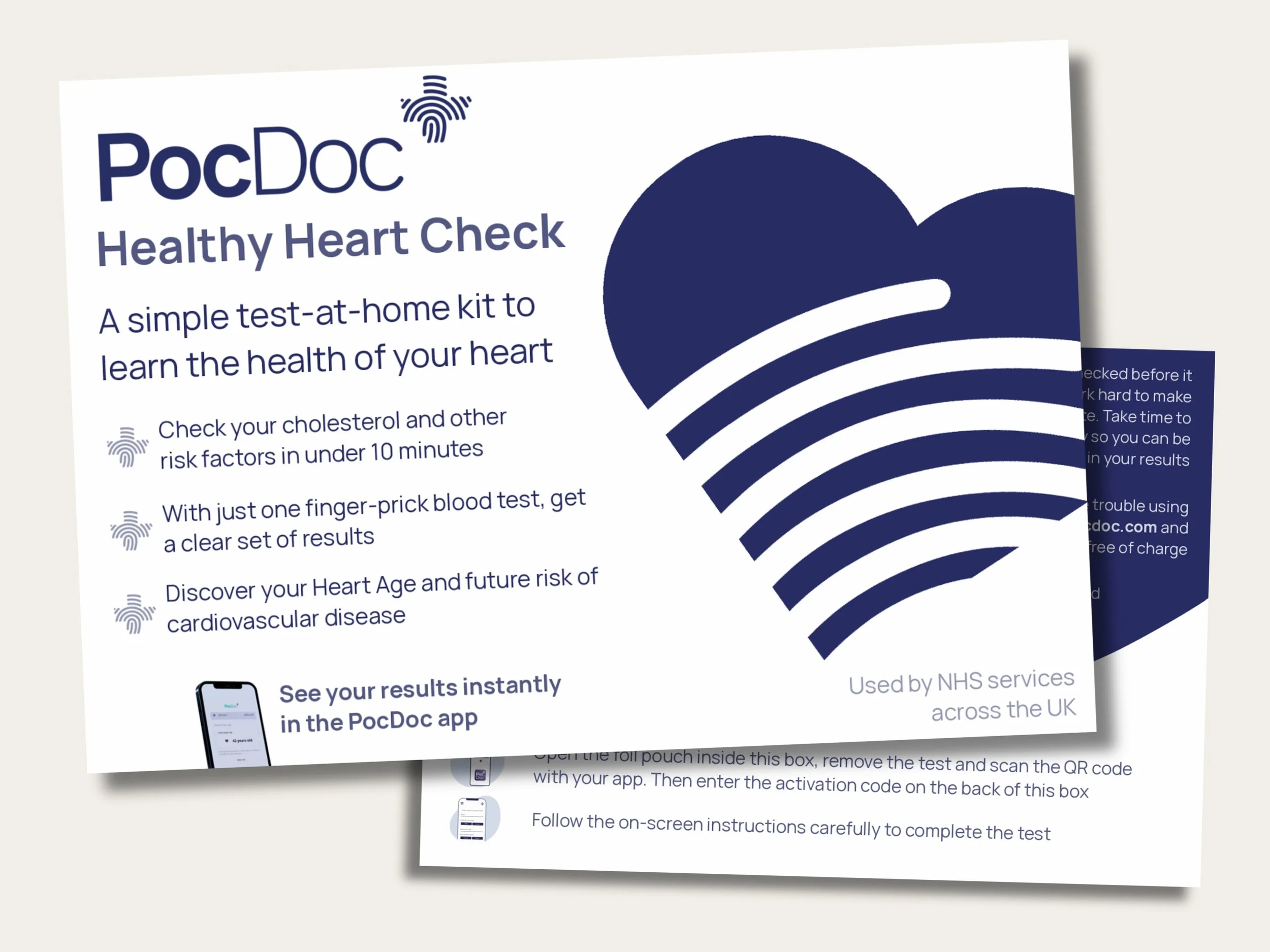
With the foundational work completed, I wrote and designed packaging for both self‑test and professional kits, simplifying instructions, tightening quick‑start panels and improving QR journeys so users can complete the test with confidence.
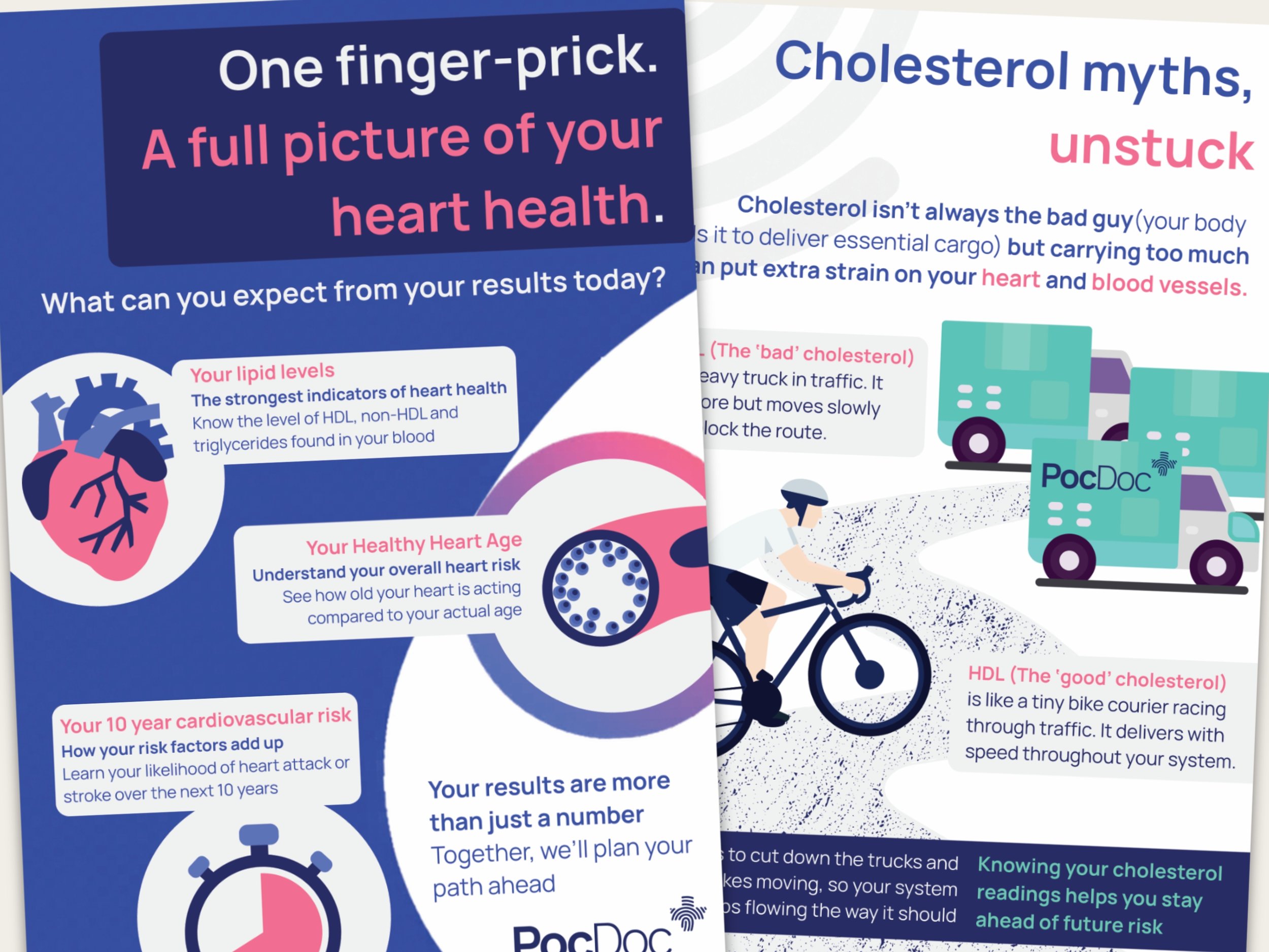
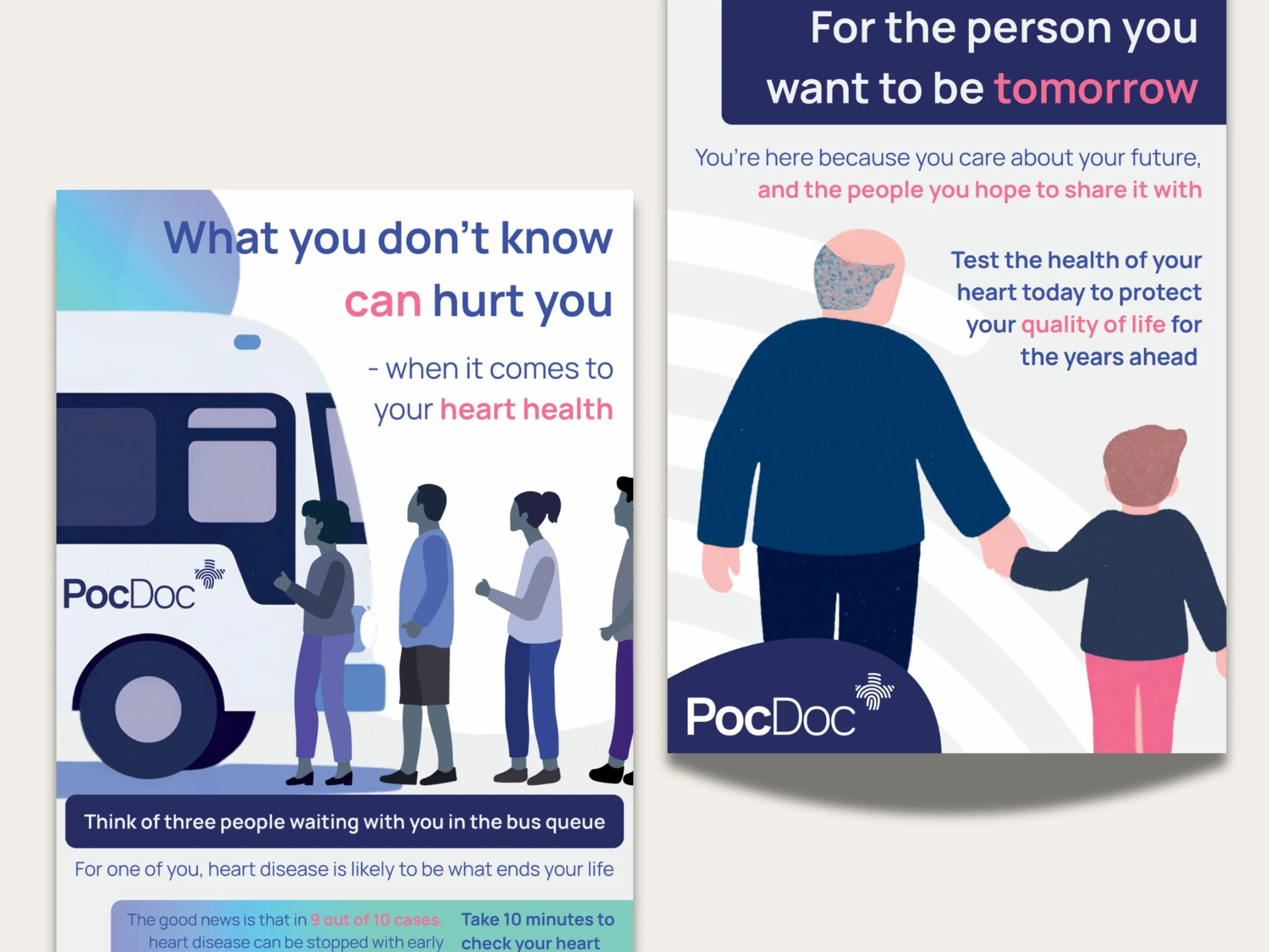
Across the community bus, I created waiting‑area and consulting‑room posters that turn statistics into relatable messages, explain results in everyday language, and build trust before and after testing.
All materials were aligned to the new tone, ensuring a consistent experience wherever people encounter PocDoc.
The difference
PocDoc now communicates with clarity, warmth and clinical confidence, giving people a simple, trustworthy way to understand their heart health and take action.
Reach outWords move mountains
Need a burst of creative strategy?
